

phishing
July 13, 2026
Why Your Reporting Button Has Bad Conversion
# Programme
Borrowed, Part 1: What product conversion funnels and deceptive pattern research can teach phishing reporting

Ant Davis
This is the first piece in a new series called Borrowed. The idea is simple. Security awareness keeps solving problems that other industries solved years ago, usually because nobody in this field was looking outside it. Product design, marketing, public health, behavioural science, they've all been quietly running experiments on exactly the problems awareness practitioners wrestle with daily. Each piece in this series takes one of those borrowed ideas and applies it directly to the job. First up: the reporting button, and what product teams already know about conversion that security teams have never bothered to ask.
Phish Reporting as a Product
If your phish reporting button had to justify itself in a product review, it would fail. Buried three clicks deep, unclear what it actually does, silent once you use it. No product team would ship that. Security teams do it every day and call it awareness.
Borrow a term from product design: conversion rate. The percentage of people who start an action and actually finish it. A checkout page converting at 40% gets torn apart in a product review. A reporting button used by a fraction of the people who spot something suspicious gets nothing. Most programmes don't even measure it.
The funnel nobody maps
Every product team maps its funnel. Most security awareness programmes treat the report button as an on/off switch. It isn't. There's a full sequence between "employee notices something odd" and "report submitted", and every step loses people.
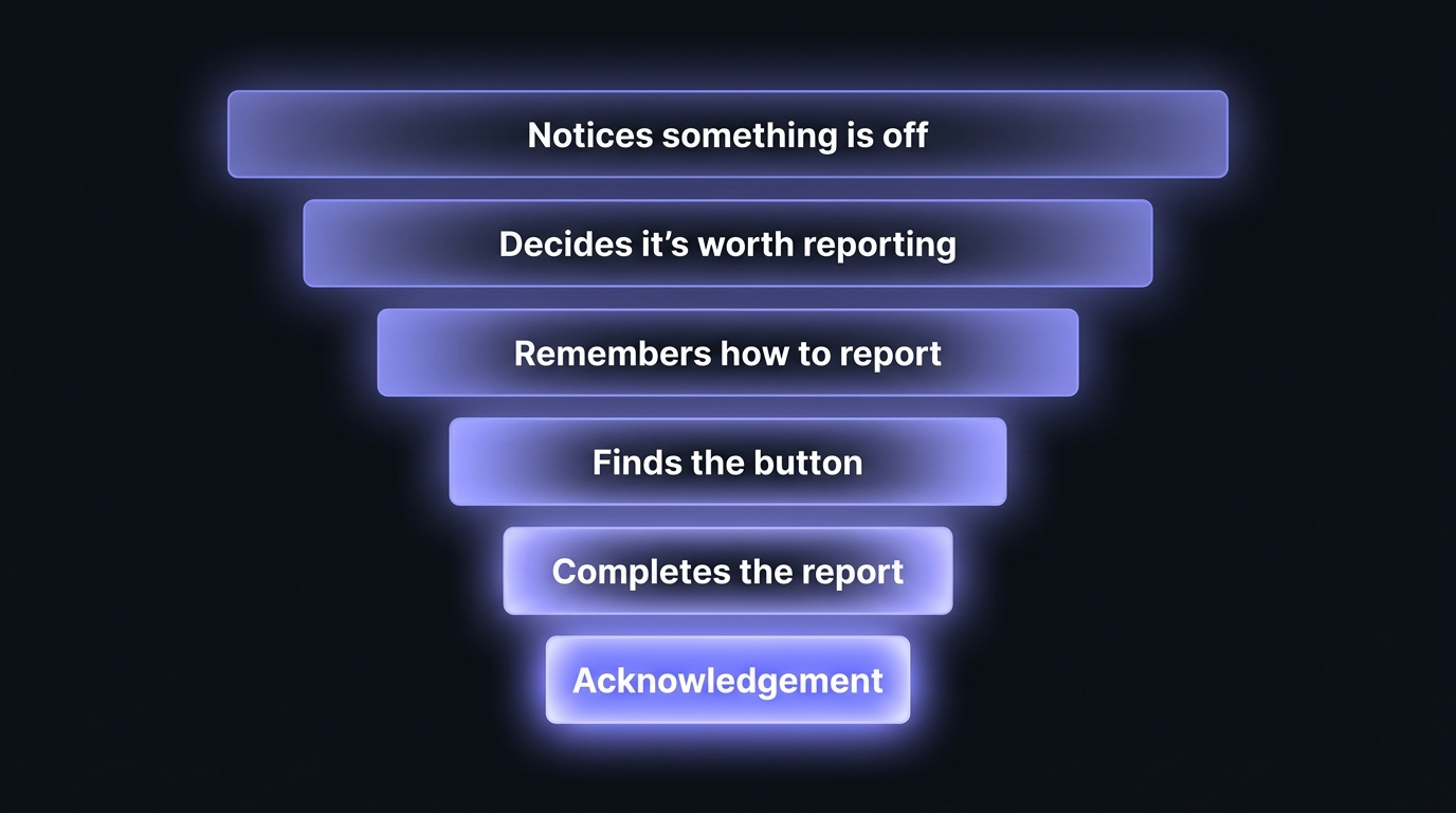
Most programmes train step one. Spot the phish. Everything after that gets left to whatever the mail client happens to allow.
Where the drop-off actually happens
Deceptive pattern research has a name and a paper trail. UX researcher Harry Brignull coined the term in 2010 and built a taxonomy of the specific tricks that make people give up or get tricked, roach motel (easy to get in, hard to get out), confirmshaming (guilt-tripping someone out of the action they actually wanted), and misdirection (burying the option you don't want people to take). Every one of these has a direct match in phishing reporting, just built by accident instead of on purpose.
Security teams recreate every one of these patterns without meaning to.
Click depth, the roach motel problem - Open a separate app, find a plugin, remember an address, and you've built the same trap Brignull catalogued: easy for the phish to arrive, hard for the report to leave. Most people won't push through three steps for something they're not even sure matters.
Ambiguous labelling, the misdirection problem - A button labelled "Report" doesn't say what happens next, who sees it, or whether getting it wrong causes trouble. Uncertainty is friction. People default to doing nothing, exactly the outcome misdirection is designed to produce elsewhere.
No feedback loop - The biggest one, and the easiest to fix. Someone reports a phish and hears nothing back. No confirmation, no thank you, no outcome. The action disappeared into a void. Why would they do it again.
I lived this one directly. For a long stretch I had users forward suspicious emails to a phishing address instead of using a button, because the button options available at the time looked bad and didn't work reliably. Being on Gmail and Google Workspace made it worse, not better. The native tooling simply wasn't there, so the workaround became forwarding by hand. Reports still came in, but every step of it was manual, and there was no built-in acknowledgement at all. Every friction point in this piece, I had to design around rather than solve with the platform.
Fixing the funnel, not the poster
The report button needs an owner, and it needs to be treated as a product feature, not something bolted onto the mail client.
Reduce the click depth - As few clicks as possible, from wherever the person already is, reading the email, in the app, on their phone. Every extra step between noticing something and reporting it is a chance to talk themselves out of it, or simply get distracted and move on. If explaining how to report it takes more than a sentence, the tool has already lost. The test isn't whether reporting is possible, it's whether someone mid-task, slightly unsure, and not particularly motivated will actually finish the action without thinking twice.
Make sure people understand what happens, before they ever need to click - A label only has room for a few words, not an explanation, so trying to cram the reassurance into the button itself is the wrong fix. That understanding needs to already exist by the time someone's staring at the button trying to decide, built through how the tool gets introduced when it's rolled out, not guessed at the moment. If people were told clearly, once, what reporting actually triggers and that a wrong call doesn't get them in trouble, the button doesn't need to do any convincing on its own. The label just needs to be found. The understanding is already there.
Build the association, not just the button - When you call 999, you know the police are coming. That expectation isn't written on the phone, it's built through years of the behaviour and the outcome being linked. A reporting tool needs the same thing. People should know that reporting to it means a response within an expected timeframe and that timeframe should be as close to instant as possible, which is possible with most modern phishing vendors. Without that association, the button is just a label. With it, the label becomes a promise people trust enough to act on.
Close the loop, every time - Someone reports something and hears nothing back, and from their side the action just disappears. No confirmation it arrived, no sense anyone looked at it, no idea whether it mattered. That silence teaches people the button doesn't do anything, which is the opposite lesson you want them learning. An automatic acknowledgement the second something is submitted fixes the immediate gap, even a single line confirming it's been received and someone's looking at it. Better still is a follow-up once it's been triaged, telling them what it actually turned out to be, real threat, false alarm, already known about. That follow-up is what turns reporting into a habit rather than a one-off. People repeat actions that visibly do something. They stop repeating actions that seem to vanish.
Hide the other buttons - Outlook has its own "Report" options. Gmail has its own "Report spam" and "Report phishing". If your dedicated reporting tool sits alongside the native platform button, people have two options that sound identical and do completely different things. Most won't know which one actually reaches the security team, so they'll pick whichever is more familiar, which is usually the native one, not yours. This is possible to fix in most mail clients, but it takes deliberate configuration, not a default setting. It should be a clear requirement for whichever team is rolling the button out, not an afterthought once it's live. Deploying the button is only half the job. The other half is clearing away everything competing with it.
The metric to start tracking
Click rate on simulated phishing gets tracked obsessively. Reporting conversion barely gets tracked at all. Start measuring the ratio between people who saw a real or simulated phish and people who actually completed a report. That number will be uncomfortable. It's also the only one telling you whether the reporting mechanism works, rather than whether the training slides looked convincing.
Map the funnel. Fix the friction. The behaviour follows the design.
Before assuming any of this is fixed, sit with your people and watch. Ask a handful to report something, real or simulated, and just observe. Where do they hesitate? Where do they ask what happens next? Where do they give up and forward it to a colleague instead? The funnel only means something once it's been tested against the people actually facing the threats, not assumed from a diagram.
Coming up in Borrowed, Part 2: What memory research gets right that annual security training gets wrong.
Comment (1)
Popular

Dive in
Related
Video
On-demand webinar: Gamification to Level up your Security Awareness Training Program, with Yu-Kai Chou
By Maxime Cartier • Jul 1st, 2026 • Views 35
Content
The Octopus Principle: What a Pink Octopus Taught Me About Security Awareness
By Ant Davis • Jul 6th, 2026 • Views 36
Video
On-demand webinar: Gamification to Level up your Security Awareness Training Program, with Yu-Kai Chou
By Maxime Cartier • Jul 1st, 2026 • Views 35
Content
The Octopus Principle: What a Pink Octopus Taught Me About Security Awareness
By Ant Davis • Jul 6th, 2026 • Views 36