

Brand
July 6, 2026 · Last updated on July 9, 2026
The Octopus Principle: What a Pink Octopus Taught Me About Security Awareness

What Octopus Energy taught me about standing out in a sea of sameness

Ant Davis
Sometimes inspiration comes from the most unexpected places.
I've been a long time listener of the Nudge podcast, and a recent episode got me thinking. Host Phil Agnew sat down with Pete Miller from Octopus Energy to talk about logos and what makes them work. And as I listened, I kept thinking: this is us. This is the security awareness world.
When Octopus Energy came to market, they faced a category that was unloved, visually bland, and completely uninspiring. Every competitor looked the same. The imagery was tired, the tone was dull, and nobody cared. Sound familiar?
That's the challenge we all face every single day.
Octopus did something about it. They created a brand so distinctive, so different from everything around it, that people couldn't ignore it. A pink cartoon octopus. Big eyes. A name that had nothing to do with energy. Everything about it said: we are not like them. And it worked. Twelve billion pounds in revenue and thirteen million customers in a decade.
The science backs this up. In 1933 a German researcher called Hedwig von Restorff found that a single distinctive item in a list of uniform ones is remembered far more reliably than everything around it. The von Restorff effect. When something stands out, the brain flags it as worth remembering. When everything looks the same, nothing gets retained.
Security awareness has its own version of the tired blue flame. The padlock. The warning triangle. The hacker in a hoodie. The stock photo of someone looking worried at a laptop. We built this visual dialect collectively, borrowed from the same vendors and template libraries, and ended up with something so consistent and so familiar that the brain has learned to skip past it entirely.
But this isn't just about visuals.
It's about tone of voice. The language we use. The level at which we approach people. Most security awareness communications talk down to employees, or talk past them entirely, wrapped in formal language that sounds like it was written by a committee and approved by legal. The organisations that cut through do something different. They sound like a human being talking to another human being. They meet people where they are rather than where policy says they should be.
Octopus understood this too. Constantine the octopus was just the start. The follow up episode of the Nudge podcast goes deeper into the methods Octopus used to keep audiences engaged over time. Spinning wheels, surprise discounts, campaigns built around genuine moments of delight. They didn't just look different. They kept finding new ways to stay interesting to people who had every reason to switch off. That episode is worth your time as well and I'll link to both in the show notes.
The good news is that standing out doesn't require a huge budget or a complete rebrand.
It doesn't have to be a cuddly character with cute eyes and a smiley face. Sometimes it can be a consistent colour palette. A simple strapline. One piece of imagery used repeatedly. The consistency is the thing. That one small element that stands out from everything else is what makes the difference between noise and notice.
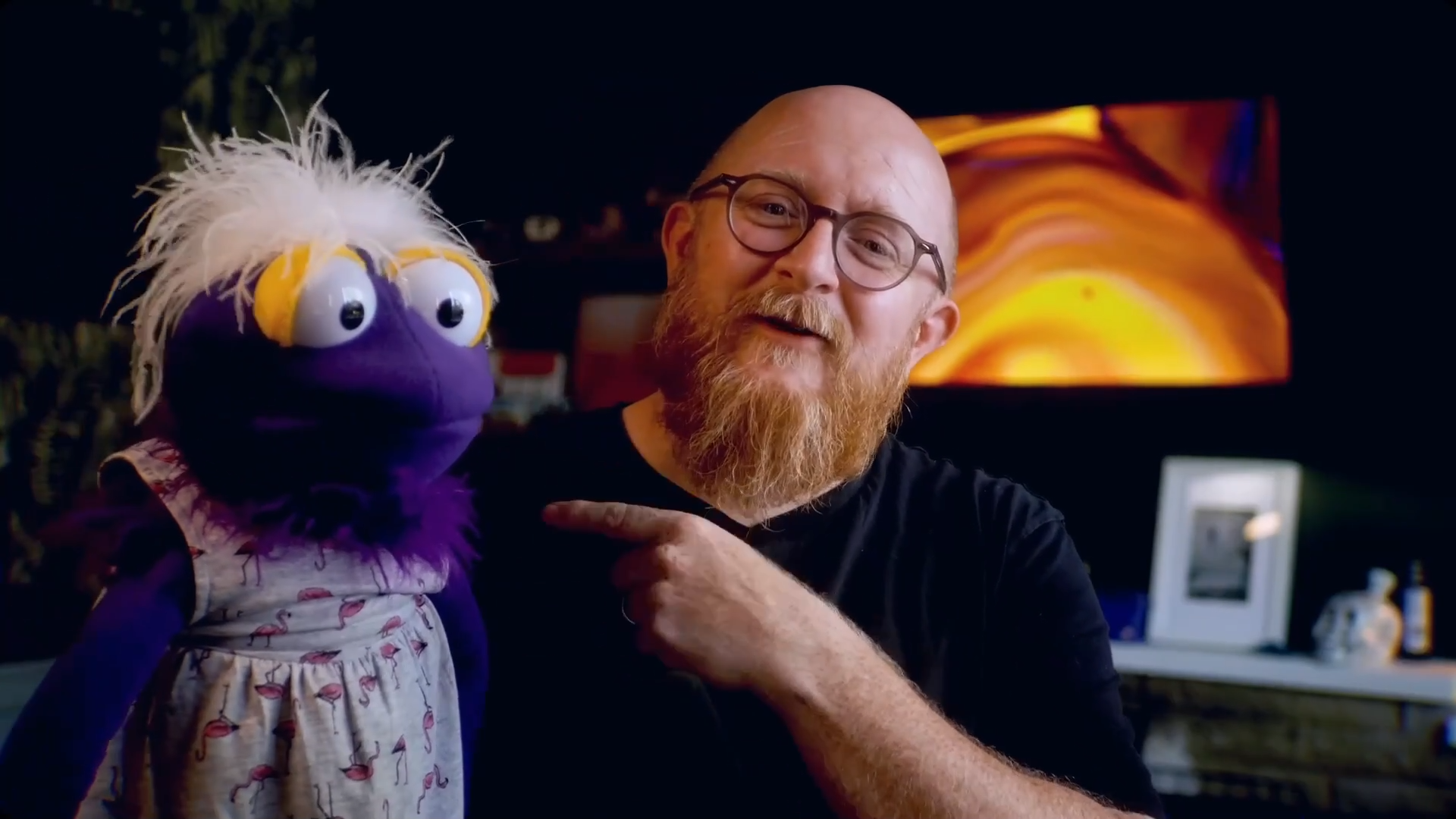
During my time at Ocado I used a purple puppet. Her name was Georgina, George for short, and she was treated like an employee. She appeared in training, in posters, in videos, in animation. She was hand drawn. She was computer animated. And she was real, an actual puppet. George had a personality, a look, and a consistency that nothing else in our internal communications had.
The most remarkable thing about George is what happened when I left.
She stayed.
I left Ocado nearly two years ago. George has been going strong for over seven years. She carried on without me, still recognised, still cutting through the noise of internal communications. I built a visual identity and a brand that outlasted my time there and still has impact now.
Was it always easy? No. I was regularly the thorn in the side of the brand team. Other teams would ask to have a brand like mine, which didn't always go down well with the people who owned the official brand guidelines. I asked for forgiveness rather than permission. And I was supported by my CSO, who understood that standing out wasn't a nice to have. It was the job.
So have a think about what you could use in your organisation. It doesn't have to be a puppet. It doesn't have to be a pink octopus. You could start small. A colour. A character. A phrase that's yours. A tone that sounds like you rather than like a policy document. From those seeds, something remarkable can grow.
Because just standing out in an inbox, just being the one thing that looks different from the mind numbing training notifications and the thousands of other messages that go out every day, just making someone pause and actually look at what you sent, that's where behaviour change starts.
Not with a padlock. Not with a warning triangle. With something that someone actually notices.
This post was inspired by the latest episode of The Awareness Practitioners podcast, The Octopus Principle: What a Pink Octopus Taught Me About Security Awareness. Available now on YouTube , Spotify and Apple Podcasts .
The Nudge podcast episodes that started it all, What Makes a Good Logo and the follow up on nudges with Pete Miller, are both at nudgepodcast.com .
Comments (3)
Popular

Dive in
Related
External Content
Oli Inkley: From Shop Floor to Security Culture | The Awareness Practitioners
May 15th, 2026 • Views 3
Content
What Spaced Repetition Research Says About Why Annual Training Doesn't Stick
By Ant Davis • Jul 20th, 2026 • Views 3
Video
Does Security Awareness Training Work? Fixing the Flaws Behind “Training Fails” Headlines
By David Badanes • Feb 27th, 2026 • Views 19
Video
On-demand webinar: Gamification to Level up your Security Awareness Training Program, with Yu-Kai Chou
By Maxime Cartier • Jul 1st, 2026 • Views 35
External Content
Oli Inkley: From Shop Floor to Security Culture | The Awareness Practitioners
May 15th, 2026 • Views 3
Video
Does Security Awareness Training Work? Fixing the Flaws Behind “Training Fails” Headlines
By David Badanes • Feb 27th, 2026 • Views 19
Video
On-demand webinar: Gamification to Level up your Security Awareness Training Program, with Yu-Kai Chou
By Maxime Cartier • Jul 1st, 2026 • Views 35
Content
What Spaced Repetition Research Says About Why Annual Training Doesn't Stick
By Ant Davis • Jul 20th, 2026 • Views 3